
Introducing My Analytics: See Exactly How You're Using Arcframe
Every account now has a personal usage dashboard — generations, credits burned, success rate, and which models you actually reach for, all in one place.
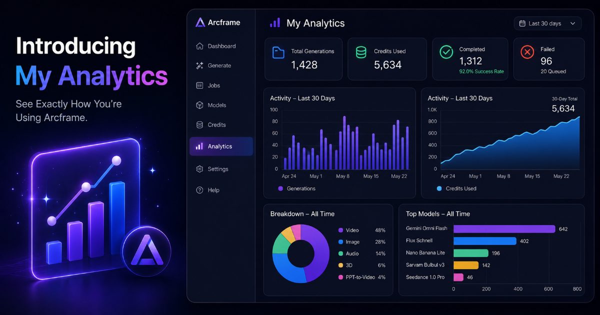
Every account now has its own usage dashboard
It's easy to lose track of how many credits you've spent, which models you actually reach for, or whether your last few generations succeeded or failed. My Analytics answers all of that from one screen — available now to every Arcframe account, on every plan.
Find it in the sidebar (the chart icon) or go straight to arcframe.ai/analytics while logged in.
What's on the page
Overview
- Total generations — every job you've ever run
- Credits used — total spent across completed jobs
- Completed — with your overall success rate
- Failed — plus how many are still queued or processing
Activity — last 30 days
- A day-by-day bar chart of how many generations you ran
- A day-by-day area chart of credits burned, with a 30-day running total
Breakdown — all time
- A donut chart of your output-type mix — Video, Image, Audio, 3D, PPT-to-Video
- A bar chart of your top models by generation count, so you can see at a glance what you actually use versus what you tried once
Why this is useful
A few concrete ways people use it:
- Spot a failed-job spike early instead of discovering it days later
- Decide whether a credit top-up or a plan upgrade makes more sense, based on your real 30-day burn rate — not a guess
- See which model is actually earning its place in your workflow before paying for access to others
No setup required
There's nothing to turn on — if you've generated anything on Arcframe, your data is already there. New accounts see a simple empty state with a link back to the dashboard until their first generation completes.